
Designer-led, AI-built:
Meet Bene.
Bene is a benefits management platform — financial accounts, retirement planning, health and insurance. The prototype below shows what happens during open enrollment season, when the app shifts to support high-stakes, time-bound health decisions alongside year-round account management.
I designed and built it using Lovable and Claude. Every product decision was mine: structure, flows, state logic. AI wrote the code, I would tweak and push changes. This project documents key decisions and the (human) rationale behind them.
→ Try the prototype (designed for mobile — best viewed on phone or in a narrow browser window)
The problem
Benefits enrollment is high-stakes, low-frequency, and confusing. Most platforms treat it like a form to complete rather than a decision to support.
Two user needs shaped the system:
Deliberate enrollees need guidance and context
Power users want to compare and choose quickly
Both paths need to coexist without degrading the other.
Finding the product
I explored three homepage directions:
v1: Dashboard — action items, benefit grid, financial snapshot, all at the same level. During the most time-sensitive period of the year, nothing told you what mattered right now. Enrollment tasks sat alongside your retirement balance like they were equally urgent.
v2: Enrollment flow — enrollment got a dedicated block with benefit cards, cost context, and editorial content about what changed. The right content, but it pushed financial accounts below the fold. The homepage read as an enrollment app, not a benefits platform — and that breaks the connection between health plan choices and savings decisions.
v3: Editorial context (the winner) — enrollment is a single card at the top. Retirement savings and account details sit directly below. The app knows what season it is and leads with it, but the rest of the platform doesn't disappear. When enrollment closes, the card steps aside.
Key product decisions
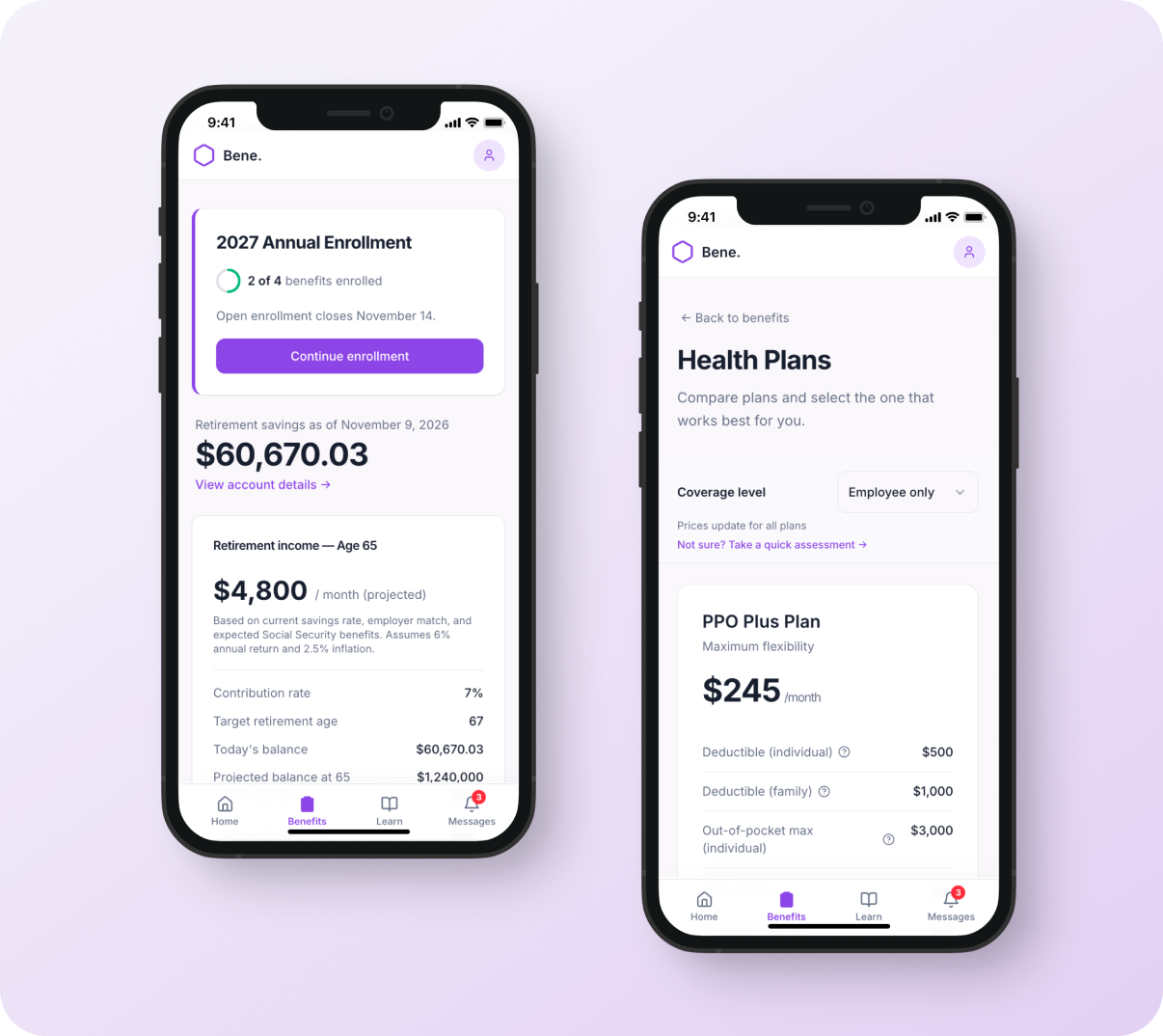
1. Central hub, individual benefit pages
Each benefit category — health, dental, vision, FSA/HSA — lives on its own page, accessed from a central starting point. It's a familiar pattern on mobile, and it means the navigational structure works the same way regardless of screen size. The hub (Benefits tab) orients the user and shows progress. Each benefit page is self-contained — compare, select, confirm — without competing for space with the others.
2. State-aware system
The product adapts based on where the user is in enrollment. Most platforms show everything at once — every option, every action, every status — regardless of whether it's relevant yet. Bene surfaces what matters at each stage. FSA/HSA stays locked until a health plan is selected, because eligibility depends on that choice. Messages and action items reflect steps completed and progress made, not a static checklist. The interface earns complexity as the user moves through it.
3. Guided and self-serve paths
The system supports two modes without forcing either. Deliberate enrollees get a short assessment that leads to a recommendation with visible reasoning — coverage level, usage patterns, priorities. The logic is shown, not hidden, so the user can disagree with the recommendation and still feel informed. Power users skip the assessment entirely and go straight to plan comparison with a coverage-level dropdown for quick filtering. Both entry points are visible in the same sticky header, and both paths land on the same plan detail page — the system doesn't branch into separate experiences that have to be maintained independently.
4. Cost as a running decision
Cost isn't shown at the end — it updates as users choose. The monthly cost bar on the Benefits page moves from $0 to $556 as benefits are added, and each selection updates the total immediately. The framing is "you're building toward a number," not "here's what you owe." This matters because enrollment decisions aren't independent — choosing a high-deductible health plan unlocks an HSA, and the contribution slider lets users adjust their savings in real time. The coverage-level dropdown carries across pages, so switching from Employee Only to Family reprices everything at once. Users see the relationships between their choices instead of doing the mental math.