Aligning navigation, reuse, & process across an enterprise platform
Principal→ Director of UX, Fidelity Investments | 2022–2025
Information architecture, design systems, governance, cross-team alignment
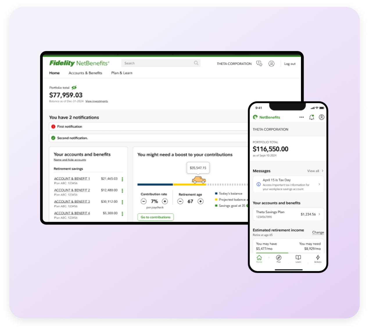
I redesigned NetBenefits.com navigation to establish shared structure across product verticals, enabling teams to ship consistent experiences for 33 million users navigating retirement, health, and brokerage products.
70+
Product teams using shared navigation and page templates
40%
Reduction in delivery time via reusable design-system assets
33M+
Users experiencing consistent navigation across products
Analysis
NetBenefits had grown organically over two decades, with some experiences dating back to the early 2000s. As the enterprise design system matured, product teams needed a clearer path to adopt modern patterns without full rebuilds. Templates and reusable components became the bridge—but first, we needed to understand what was actually blocking adoption.
To ground the work, I led an assessment with design and engineering leads from four major product verticals. We mapped navigation patterns, layout behaviors, visual inconsistencies, accessibility gaps, and design system adoption challenges.
Three themes surfaced:
Inconsistent IA: Different teams solved the same navigation problems in different ways, leaving users uncertain whether they were still in the same product.
Visual variance: Each designer interpreted the design system differently, creating experiences that looked and behaved inconsistently across pages and product verticals.
Implementation friction: Without shared patterns for navigation, layout, or UI components, developers spent time recreating existing solutions or working around mismatched designs.
Different navigation patterns across products meant users learned one model in retirement, then encountered a different one in health benefits.
These divergent approaches had cascading effects. Each navigation model required custom templates and one-off configurations. Developers couldn't reuse code. Every new feature meant negotiating which vertical's approach to follow, or inventing another variation. Improvements stayed isolated: accessibility fixes didn't propagate, research insights remained siloed.
Our audit created alignment around what the platform actually needed—structural coherence, not one more pattern or component.
Solutions
The goal was to design a system that could scale across complex products, diverse teams, and varied tech stacks—without requiring heavy governance or rewrites.
Core templates
We defined four page templates that became the backbone of the platform:
Hub Level 1: Centralized entry point for accounts, information, and key shortcuts
Hub Level 2: Single-account page with consistent content and action zones
Spoke: Details on a specific feature or service for an account
Task: Guided, step-based transactional flows (withdrawals, updates, etc.)
These templates clarified where content lived, how users moved between pages, and what actions were available at each layer.
Page templates established consistent rhythm and predictable navigation for users, as well as scalable patterns for teams.
Navigation Model
We introduced a hub-and-spoke navigation system for web that had stronger parity with the NetBenefits mobile app and mirrored actual user behavior:
Clear “Go to [Section]” destination labels
Predictable entry/exit logic across pages
Familiar patterns across devices
This eliminated unnecessary tab sets, overlapping nav bars, and inconsistent return paths.
Consolidated IA cut redundant entry points, clarified page-to-page hierarchy, and aligned with mobile app navigation.
Reusable Patterns
Once the architecture was stable, we defined UI-level patterns designed to be flexible across tech stacks. Those include:
Page-level layouts to establish information hierarchy
Content zones for quick actions, summaries, and sub-sections
Button hierarchy with standardized order, states, and responsive behavior
These patterns anchored daily design work to the templates and navigation model.
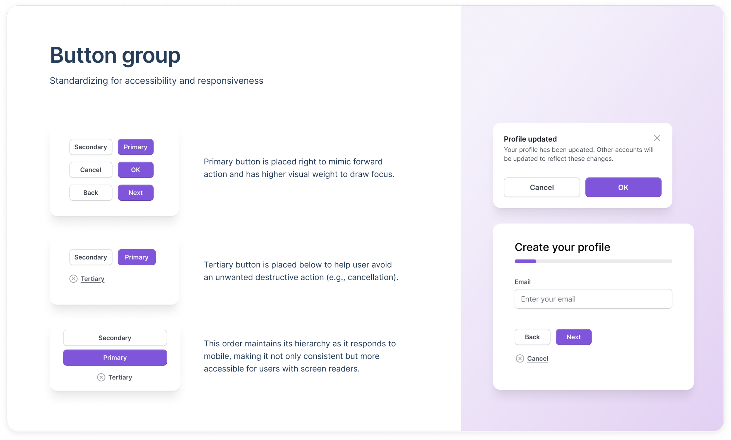
Shared patterns like button group brought consistency & accessibility to web and mobile
This prototype shows a hub-to-task flow with the button group pattern, demonstrating hierarchy, accessibility, and responsive behavior across desktop and mobile.
Partnerships
I served as a connective layer between product teams and the enterprise design system—helping teams apply templates, resolve design blockers, and scope patterns for real-world constraints.
This hands-on support was essential, but not scalable. To sustain adoption across 70+ teams, I joined pre-release product reviews and worked with governance partners to define lightweight processes: checklists for page structure and template alignment, recommended review workflows, and cross-functional checkpoints between design, accessibility, and engineering.
What this looked like in practice:
Cross-team facilitation to align vertical-specific edge cases with the shared model
Building flexible interaction patterns with designers and developers
Weekly office hours to troubleshoot navigation, layout, and UI components
Platform UX standards documentation: internal docs site and Figma playbook
System coaching: helping teams interpret templates for complex products and legacy code
These processes reduced last-minute escalations and helped teams operate more autonomously as well as engage earlier, when feedback was most useful. My role wasn't to "police" the system, but to help teams succeed in it.
Outcomes
Accelerated delivery across 70+ product teams through reusable templates and governance workflows adopted by additional business units
Reduced duplication and support requests due to clearer documentation and fewer one-off patterns
Consistent user journeys across product verticals, leading to fewer navigation-related complaints in product reviews and customer-service calls, with increased positive sentiment across product journeys
Enterprise award recognition for measurable impact on cross-product consistency
VP-UX Chapter Lead, Fidelity Investments
“Moira's leadership, generosity, and design excellence made a lasting impact on me and so many others at Fidelity! Thank you for always showing up with clarity, care, and initiative. I’m excited to see her thrive and continue raising the bar for UX.”
Senior UX Designer, Fidelity Investments
“Moira is a design force of nature and a pleasure to work with. She brought many of us together for the first time to make our work more collaborative, efficient, and rooted in best practice.”
What I’d do differently
In future implementations, I would:
Accelerate stakeholder alignment by running earlier cross-vertical IA mapping sessions
Involve engineering sooner in defining edge-case states and responsive behavior
Formalize a “starter kit” earlier—giving teams examples of how to apply templates to complex, multi-product experiences
These refinements would help teams adopt the system even faster.