Understanding patient needs throughout clinical trial participation
Product Designer II, IQVIA | 2022
User Research, Usability Testing, Journey Mapping, Content Strategy
Overview
IQVIA's Patient Portal serves over 210,000 clinical trial participants across multiple therapeutic areas. The product team was planning a UI redesign to improve engagement, but lacked foundational research on what patients actually needed. The risk: investing development budget in visual improvements while missing the real problem.
I designed and executed a 2-week research sprint combining usability testing with journey-based interviews. The findings revealed a counterintuitive insight—the portal already had strong usability (83.5 SUS score, top 10% industry-wide), but patient needs shifted dramatically as trials progressed. Early participants were comfortable with self-service; as stakes increased mid-trial, they needed proactive content and better information architecture to reduce logistical anxiety. This redirected the redesign from interaction improvements to journey-based content strategy.
2 weeks
Research sprint from protocol through synthesis and stakeholder presentation
25 recruits
Participants recruited and interviewed across three research methods
210K patients
Clinical trial participants using IQVIA products informed by this research
Research
Government regulations restricted our ability to track patient demographics and behaviors directly, making segmentation difficult. The design team needed actionable insights quickly, and multiple product teams were serving similar populations without shared research foundations.
I designed a mixed-methods study to uncover what information and tasks mattered most to patients throughout their trial journey, and what usability issues existed in the current experience:
10 generative interviews (60-minute moderated sessions)
10 A/B concept tests evaluating proposed information hierarchy
5 unmoderated usability tests with 11 task scenarios + SUS scoring
Participants included a mix of mobile and desktop users, ages 25-60, who had participated in clinical trials within the past 12 months. I synthesized 20 hours of recordings into 400+ discrete observations, organizing them through affinity mapping into 12 thematic clusters: motivations, trial entry points, side effects, tasks, notifications, touchpoints with staff, and overall journey progression.
Affinity mapping revealed patterns that weren't obvious in individual sessions—for instance, notification overwhelm affected patients regardless of trial type or age.
Key Findings
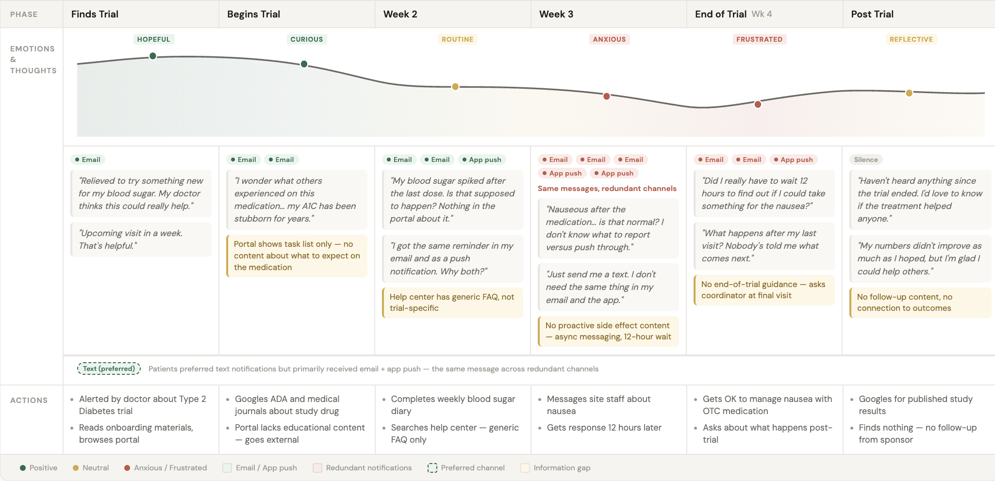
The affinity map revealed a clear pattern: patient needs changed dramatically based on where they were in their trial journey. Early participants were curious and comfortable with self-service. As trials progressed, logistical burden increased—tasks accumulated, visit anxiety spiked, and notification overwhelm drove disengagement.
Three journey-based insights emerged:
Information transparency gap (mid-trial)
71% of participants expressed anxiety about "what happens next" at upcoming visits. This wasn't a usability problem—it was a content problem. Patients needed proactive visit preparation information to reduce logistical anxiety, not better navigation.
Notification fatigue (progressive overwhelm)
Participants described checking their phones "constantly" due to trial notifications, even during work hours. As trials progressed, notification volume became the #1 cited reason for disengaging from the portal. Patients wanted granular controls for timing, importance levels, and channels.
Content organization over interaction design
The 83.5 SUS score (top 10% when normalized against 500 industry benchmarks) proved usability mechanics weren't deterring engagement. Most improvement recommendations focused on content hierarchy and task prioritization, not visual styling or interaction patterns. This freed the team to focus budget on IA improvements rather than redesigns.
Research Artifacts
To help product teams internalize findings, I created a persona and journey map grounded in affinity map themes.
Persona: Morgan, 34, Type 2 Diabetes Trial Participant
Morgan reflects common sentiments from interviews: motivated by both financial incentive and desire to contribute to medical research, comfortable with technology but overwhelmed by mid-trial task burden, seeking proactive communication about visit logistics rather than having to dig through the portal.
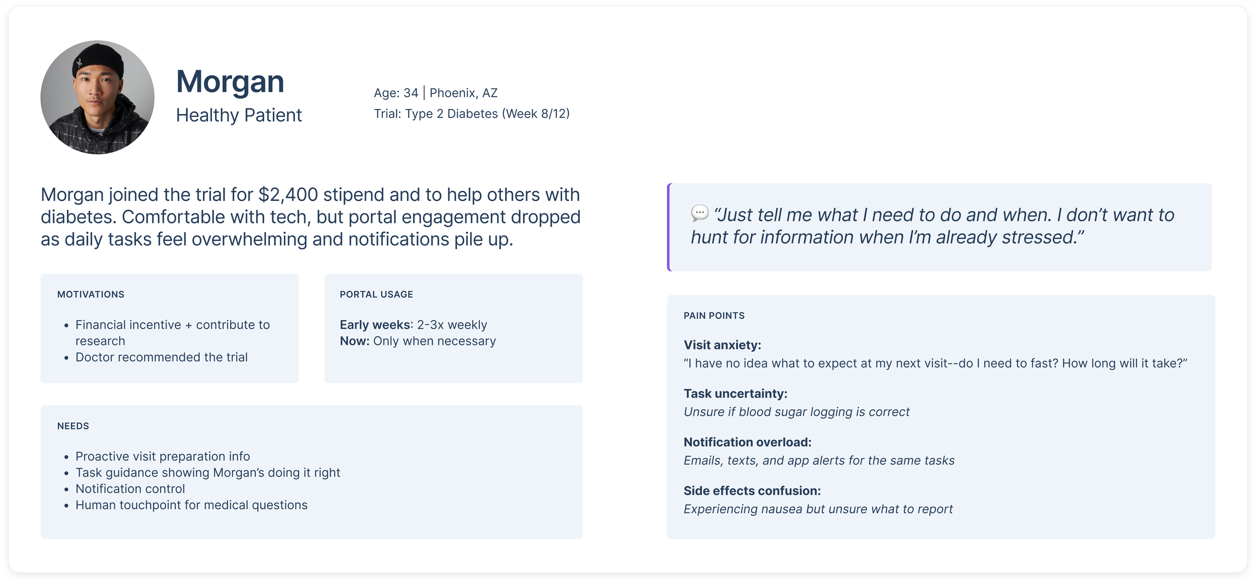
Motivations: Supplemental income + helping others with similar conditions
Trial stage: Week 8 of 12-week study
Pain points: "I keep getting reminders to log my blood sugar but don't know if I'm doing it right, or how to get help. And I have no idea what to expect at my next visit. Do I need to fast? How long will it take?"
Portal usage: Checks 2-3x weekly early in trial, now only when notifications pile up
Ideal experience: "Just tell me what I need to do and when. I don't want to hunt for information when I'm already stressed about the visit."
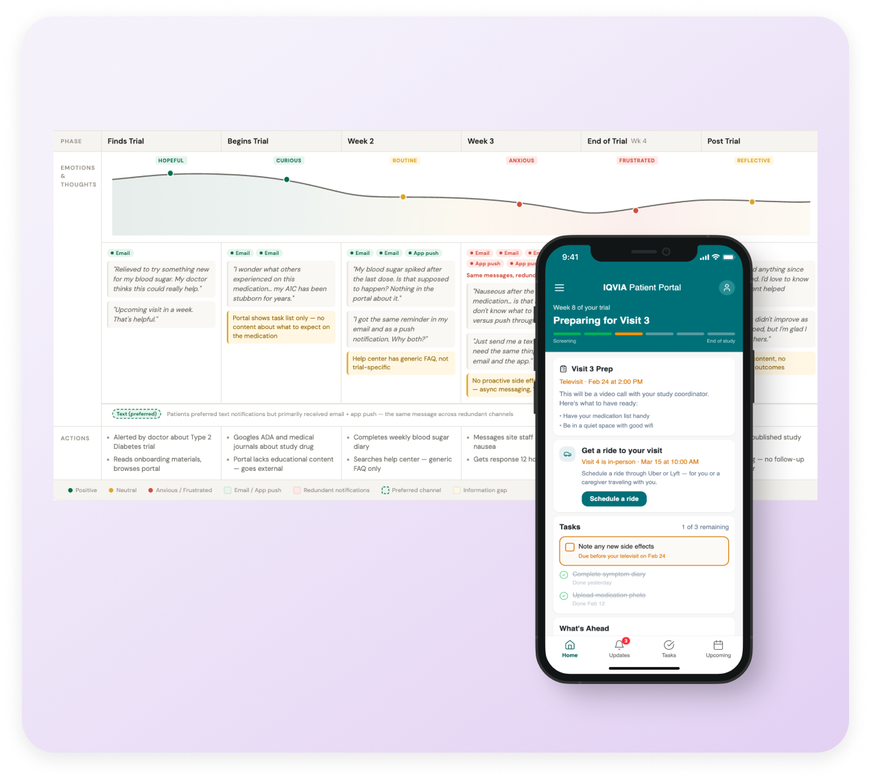
Journey Map
The journey map documents patient experience across trial phases: pre-trial, enrollment, active participation (early, mid, late), and post-trial. Each phase includes emotional curves, specific patient actions, and connections to research findings—showing product teams how design decisions fit into the larger patient experience.
The map revealed the pattern driving engagement issues:
Pre-trial/Enrollment: High curiosity, low anxiety, self-service works fine
Early participation (Weeks 1-3): Novelty of tasks, manageable volume, portal feels helpful
Mid-trial (Weeks 4-8): Task burden accumulates, visit anxiety spikes, need for proactive support increases
Late trial (Weeks 9-12): Notification fatigue peaks, desire for "just tell me when I'm done"
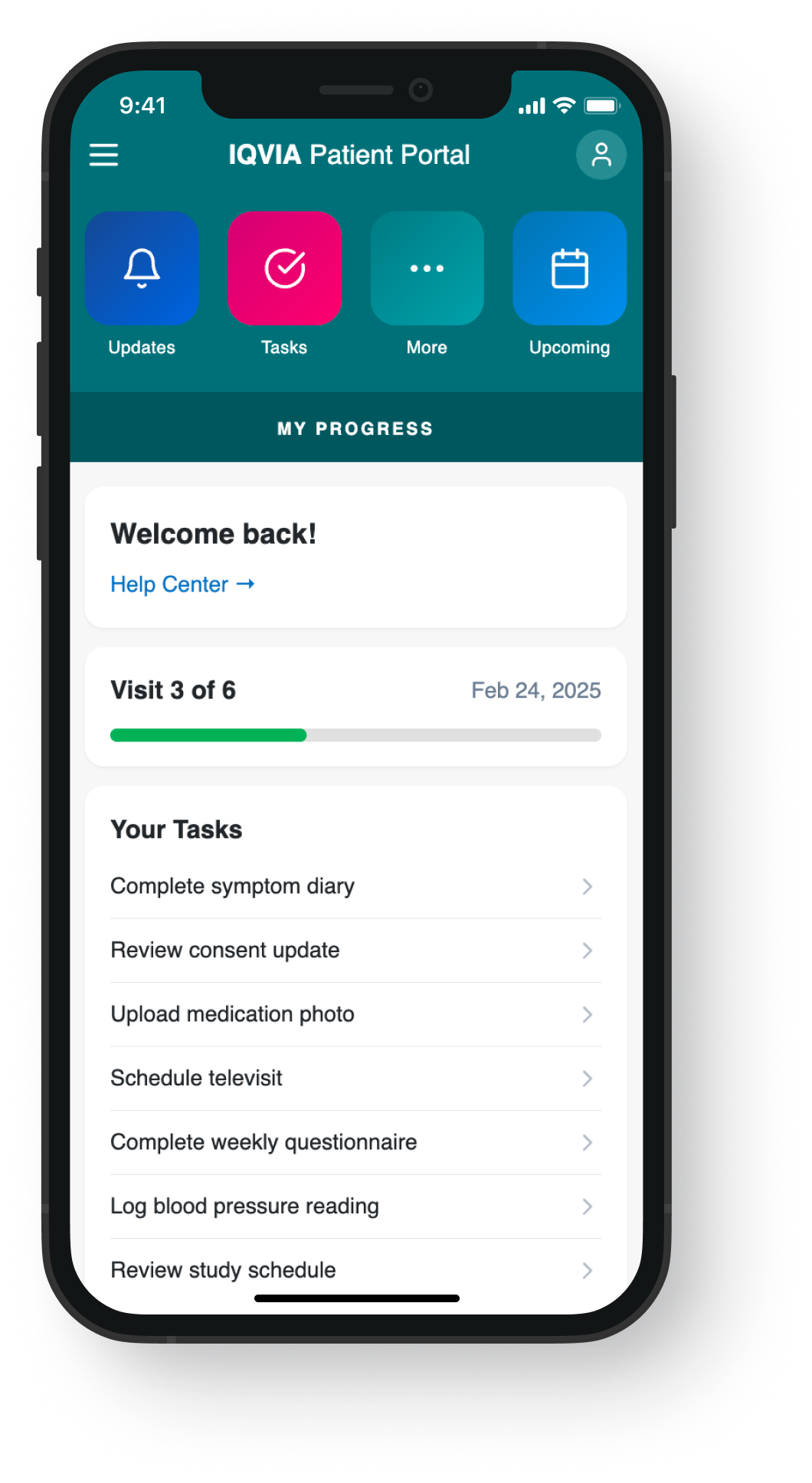
Before → Flat task list
From research to design
The research findings pointed clearly to a content and timing problem, not a UI one. These mockups illustrate how journey-based content strategy translates to screen level — shifting from a flat task list to a context-aware experience that surfaces the right information at the right moment in the trial.
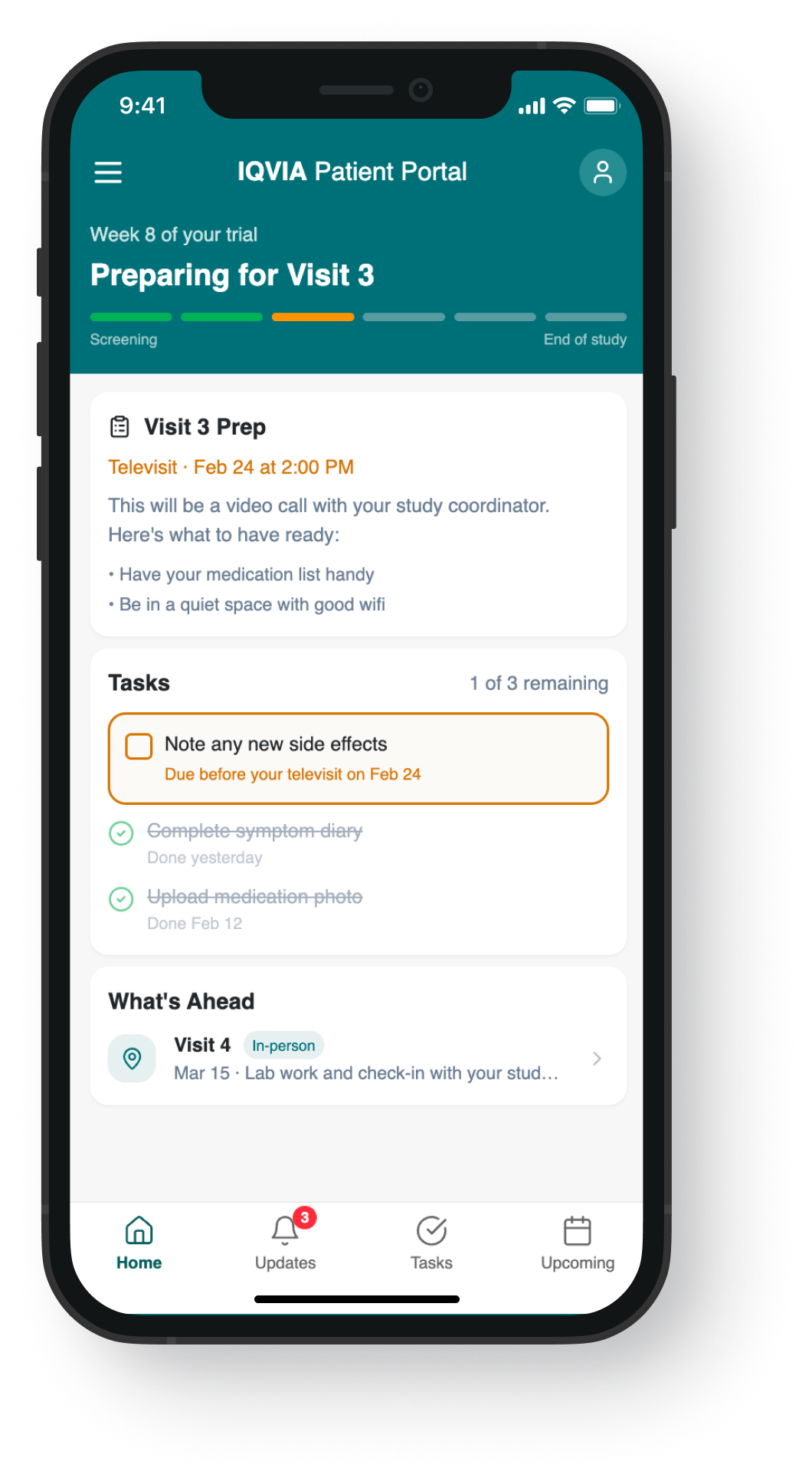
Exploration → Context-aware, new nav
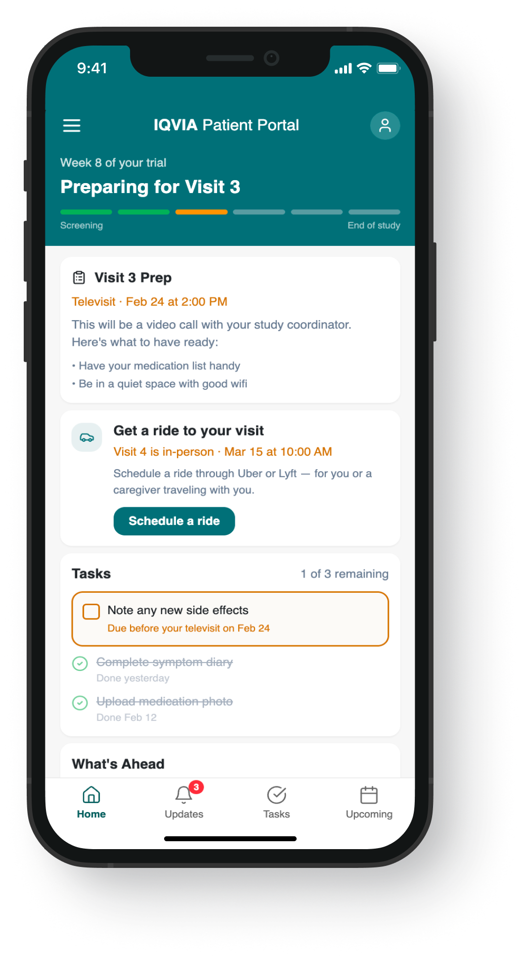
Exploration → Uber/Lyft integration, new nav
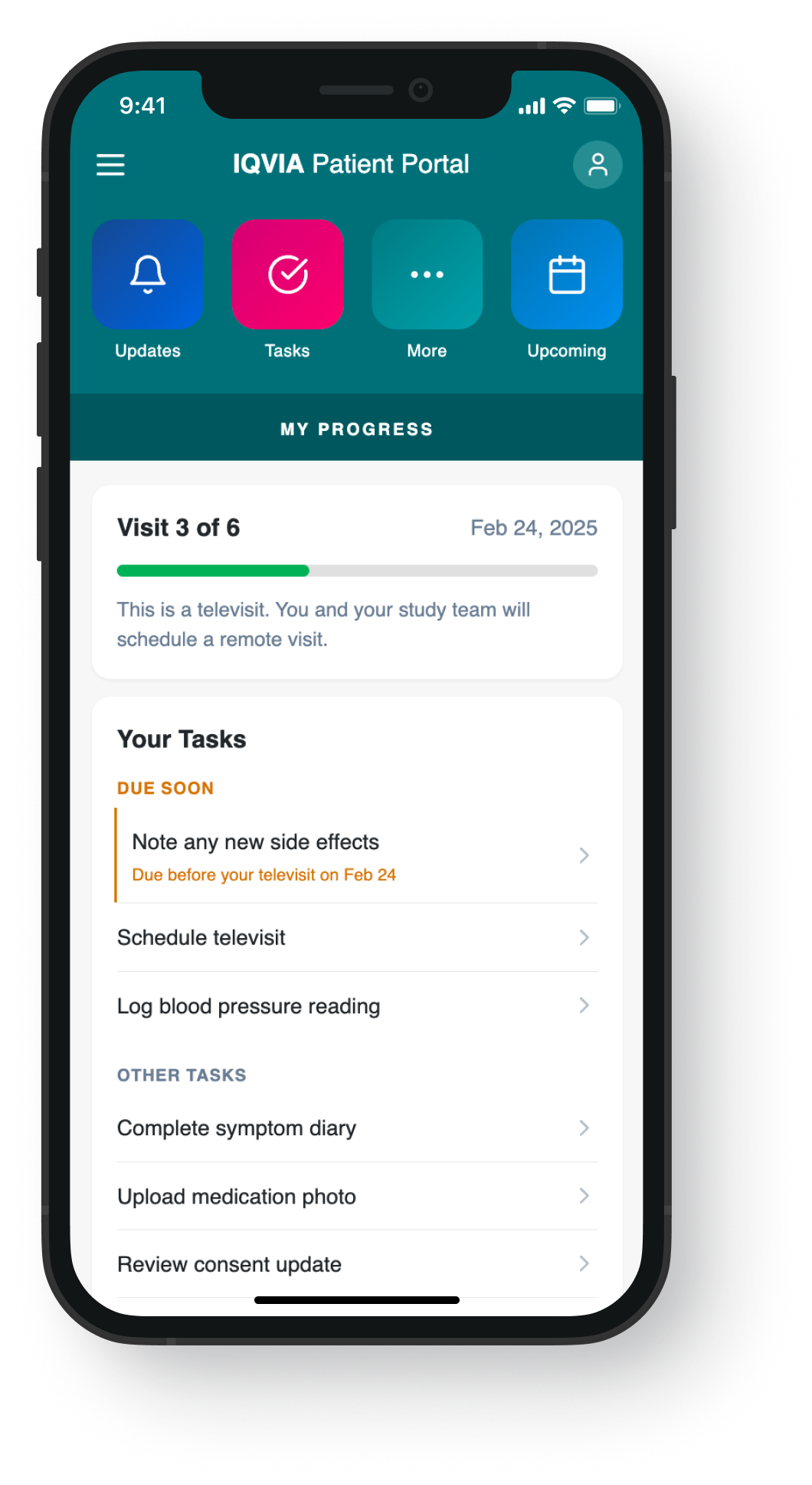
Shipped → Context-aware, original nav
Recommendations
Based on findings, I provided three strategic directions for continued research:
Broader validation:
Survey larger patient population to confirm technology preferences by age group, followed by usability testing of mobile prototypes to validate IA changes before full implementation.
User segmentation:
Segment core user groups based on behavioral factors—age, motivation for participating, trial experience—to understand what drives different needs and attitudes across patient populations.
Longitudinal studies:
Conduct in-context studies throughout trial cycles to understand information-seeking patterns, communication with site staff, and notification preferences in participants' daily lives.
Impact
Redirected redesign strategy:
The 83.5 SUS score revealed usability mechanics weren't the problem—content hierarchy was. This finding saved significant development budget by focusing the team on journey-based information architecture rather than interaction redesigns or visual styling.
Established rapid research template:
The 2-week research sprint model I developed was adopted by other designers across IQVIA, demonstrating that meaningful insights don't require months-long studies.
Created cross-product foundation:
Synthesized findings into a User Insights Playbook used by 5+ patient-facing product teams serving 210,000+ participants. This eliminated redundant research and created shared understanding of journey-based patient needs.
Built segmentation roadmap:
Established baseline patient insights that enabled IQVIA to explore targeted populations (pediatric, elderly, patients with caregivers) through follow-up studies informed by the journey framework.
Shipped validated improvements:
Research-validated design components addressing visit preparation content, notification controls, and task hierarchy were incorporated into desktop and mobile applications in Q2-Q3 2022.
UI Designer II, IQVIA
“At her core, Moira is a great communicator. Her ability to walk stakeholders through her thinking and get them excited about the next steps in the process is something more designers should aspire to do. But having the communication chops alone does not make you great at UX; Moira's process-driven and research-backed approach gives stakeholders the data and transparency they need to make informed decisions about their product.”
What I’d do differently
Expand the usability testing task set:
While 11 tasks provided good coverage, I would have added scenarios around notification management given how prominently that theme emerged in interviews.
Recruit more diverse demographics:
The average age of 41 and requirement for "average web expertise" may have skewed toward digitally comfortable users. I'd push to include participants with lower digital literacy to understand their barriers.
Build in follow-up mechanisms:
The three recommended next steps were solid, but I left before implementing them. I'd now create more detailed handoff documentation and identify stakeholder champions to maintain research momentum.
Test the redesign concepts iteratively:
Given the high SUS score, I would have advocated for testing IA changes in isolation before committing to a full redesign, reducing risk of accidentally breaking what was already working.