Enabling faster exploration and decision-making for clinical trials
Product Designer II, IQVIA | 2020–2022
Information Architecture, Interaction Design, Prototyping, Usability Testing
Overview
Adaptive clinical trials were becoming the industry norm, but the tools used to design them were slow, fragmented, and difficult to interpret. Biostatisticians had no integrated way to design, compare, or collaborate on trial protocols. Comparison happened through email and manual lookup across 2-3 different systems. It was a slow, error-prone process that created bottlenecks: high dependency on limited experts, inability to scale consulting services, and growing client pressure for faster insights.
IQVIA leadership envisioned Trial Designer as a platform that would make sophisticated statistical modeling collaborative, accessible, and scalable. I led design from foundational research through shipped product, working with product managers, clinical SMEs, engineers, and data scientists to translate complex regulatory requirements into a system biostatisticians could confidently use.
$300M
Internal cost savings + external licensing revenue projected annually
15
Number of core clinical trial workflows consolidated into one platform
Analysis
I joined three months after kickoff, inheriting a workshop, competitive analysis, and early scoped MVP features. Early biostatistician involvement was limited—they were busy supporting COVID-19 trials—so I filled gaps through targeted research:
5 in-depth interviews with adaptive design experts
A/B usability testing with 13 biostatisticians on input form patterns
Observational studies of how biostatisticians compared designs across legacy tools and email
Synthesis of workshop findings and workflow observations
Three critical needs emerged:
Structured comparison: Biostatisticians needed to evaluate multiple trial designs side-by-side, but legacy tools forced them to manually cross-reference outputs across systems and email threads.
Accessible modeling: R-code was intimidating for novice users, yet essential for advanced statistical work—the interface needed to accommodate both.
Asynchronous collaboration: Teams worked across time zones and expertise levels, requiring a way to share feedback and iterate without real-time coordination.
Early wireframes my UX teammate and I assembled in LucidChart to understand current workflows across separate tools
Solutions
End-to-end workflow
My first deliverable was a simplified product workflow covering:
project creation
session management
design input
output generation
comparison + collaboration (net-new capabilities)
This model became the backbone of Sprint 0 and set expectations for the MVP. I socialized it with stakeholders across product, engineering, and biostatistics teams to align on scope and surface technical constraints early.
A clear, end-to-end view of how projects move from setup to output—used to align the team on what the MVP had to support.
Inputs form: Solving for complexity
Each adaptive design type requires 20–30 inputs that feed R-powered computations. Trial Designer needed to serve both expert biostatisticians (comfortable writing R-code) and novices (who needed structured guidance)—embodying the "bleeding-edge calculator" part of the vision.
Our initial approach relied on traditional tooltip icons—hover to reveal definitions—but user feedback showed this was slow, visually noisy, and hard for novices to interpret in context.
I introduced a new pattern that grouped correlated fields and surfaced guidance inline—right where users needed it, not in a separate overlay.
This reduced distraction, created a clearer mental model for novice users, and grew trust. By abstracting R-code complexity into structured input fields, the form made advanced statistical modeling accessible without sacrificing sophistication.
I ran an A/B test with 13 statisticians: 11 of those preferred the contextual pattern. The pattern was later adopted into IQVIA's internal design system used by 80+ designers.
Related inputs were spread across the page with no real hierarchy. Key definitions lived inside hover-only tooltips, which slowed people down and made the form harder to interpret—especially for less experienced users.
I reorganized the form into meaningful sections and moved explanations inline. This reduced scanning, improved comprehension, and tested better with internal statisticians—11 of 13 preferred the contextual pattern.
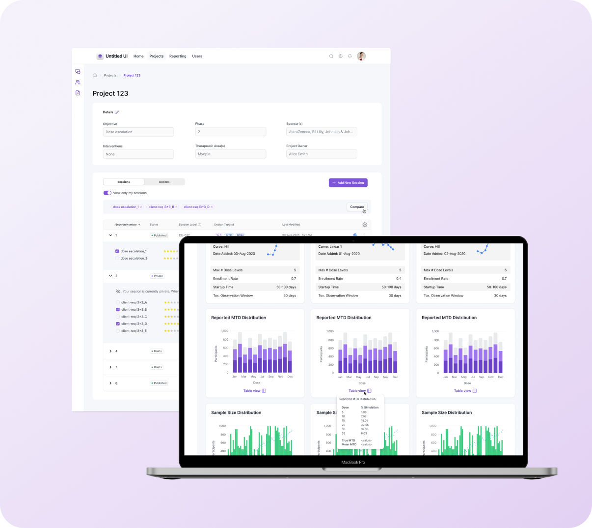
Projects page: Enabling comparison & collaboration
The project homepage organizes sessions and design options, which can number in the hundreds. Early exploration showed the nested accordion structure wouldn't scale: users couldn't quickly identify which results to compare, important attributes were buried, the "Compare" action wasn't discoverable, and cross-session comparison meant working across multiple tabs and external systems.
Solutions:
Flat table with accordion organization: made selection and comparison easier while maintaining the structure to scale for hundreds of results
Promoted key attributes to table view: surfaced critical details like design type, ratings, and session metadata
Persistent "Compare" action: visible for selected results
Cross-session comparison support: enabled users to compare designs across different sessions within the same project
Before (left): Nested options obscured identifying details, and the table lacked the structure to scale for hundreds more options. After (right): Introduced a flat table with accordion organization to make selection + comparison easier.
Outputs page: Comparing results
Outputs contain statistical graphs, confidence plots, and tabular metrics—voluminous information that reviewers rely on to decide which design should be recommended to clients. Early versions displayed each design in a separate vertical column, requiring users to scroll through one design, then scroll through the next to find corresponding metrics. Table data lived in separate sections, and without filtering capabilities, users faced an overwhelming flat list of results.
Solutions:
Modular card structure with shared vertical alignment: reorganized content so that equivalent information appears at the same position across all designs, enabling direct side-by-side comparison across up to 3 designs horizontally
Hierarchical organization with filtering: supports the Project > Session > Result structure, enabling users to compare within or across sessions with user-controlled ordering and filtering for large data sets
Integrated table view as hover tooltip: consolidated tabular data beneath each chart as an on-demand overlay, improving accessibility and keeping visualizations unobstructed
Peer ratings and collaborative evaluation: allow project teams to upvote stronger designs asynchronously, reducing review cycles
Post-handoff enhancements: "default" visual-first view added in R2 (validated through beta testing) and additional sort options
This prototype demonstrates selecting trials to compare: users expand accordions, select designs across sessions, and navigate to side-by-side Results view.
Partnerships
My role required translating domain complexity into a usable product—quickly. This meant:
Co-designing with biostatisticians: Weekly working sessions to validate formulas, field groupings, and data labels.
Partnering closely with developers: The R-code integration was substantial, so I worked directly with the R engineering team to confirm assumptions and align UI behaviors with mathematical outputs.
Supporting rapid documentation + story elaboration: I frequently helped BAs break features into epics and user stories to accelerate delivery.
Facilitating decisions across SMEs: Adaptive design experts often had differing opinions; my job was to bring clarity to requirements and tradeoffs.
Outcomes
Unified tool replacing a patchwork of legacy programs, improving workflow efficiency
Asynchronous collaboration, reducing emails and speeding up design review cycles
Cleaner, more polished outputs for client presentations
Increased learning support for less-specialized users through contextual guidance
Internal cost savings + new revenue potential projected at~$300M/year
Internally, the tool became a core asset for biostatisticians managing high-risk, highly regulated work—especially during COVID-era resource constraints.
Senior Delivery Architect, IQVIA
“Moira delivered an outstanding design roadmap and provided valuable insights for the product that went beyond generating a nice interface. Her work is timely and of highest quality.”
UX Group Lead, IQVIA
“I always appreciated Moira's unshakable and level-headed tenacity, process orientation, and fierce devotion to the user.”
What I’d do differently
Introduce faceted search earlier to address the scale of design options
Prototype more rigorously with R engineers to validate edge-case states sooner
Formalize a collaborative “design review ritual” across statisticians to speed alignment
Invest earlier in progressive disclosure patterns for dense input and output pages
These would shorten the refinement cycle and strengthen long-term usability.